
B2B SaaS Website Copy: 9 Rules to Turn Visitors Into Demo Requests
- Olivia Cal

- Mar 30
- 14 min read
Updated: Apr 13

If your B2B SaaS website copy sounds like every other SaaS vendor’s website, it’s probably costing you pipeline right now. That means: features stacked on features, jargony headlines, and a vague hero section.
According to research by Forrester, B2B buyers now choose a preferred vendor before the buying process officially begins. They're already forming an opinion of you in the anonymous research phase, and that’s why your website copy is vital.
The average conversion rate for a B2B SaaS landing page sits around 1.1%. That's the nature of long sales cycles and buying committees - not because your copy is bad. Research also tells us that copy written at a 5th–7th grade reading level converts at 11%, more than double the rate of college-level prose. These nine rules are what separate B2B SaaS websites that convert from the ones that are slowly haemorrhaging pipeline.
Key takeaways
Your buyer is invisible: 80% of the B2B buying journey happens before they ever speak to sales. Your copy has to win them over in the dark.
Clarity over cleverness: Vague headlines and jargony copy are conversion killers. Prioritise plain language.
Social proof placement matters: Trust signals earn you the click. Where you put them determines whether they work.
One CTA: confusing visitors with multiple competing calls-to-action is a conversion leak.
Copy is never done: your website should be a living, iterated asset.
Why isn't my B2B SaaS website copy converting?
Before we get to the rules, let’s look at why most B2B SaaS copy fails. It probably isn’t laziness, and instead one of four patterns that strangle conversion:
Writing about features instead of outcomes: Most SaaS homepages describe what the product does. Buyers need to know what it changes for them.
Writing for internal stakeholders rather than the actual buyer: Copy that's been softened, watered down, or committee-approved until it says nothing to nobody.
The ‘we’ problem: Too much B2B SaaS copy is written from the vendor's perspective (‘We help businesses…’), when buyers want to see themselves in the story.
A lack of above-the-fold clarity: If a visitor can't tell what you do within three seconds of landing, you've probably already lost them.
6sense's 2025 B2B Buyer Experience Report found that 95% of the time, the winning vendor is already on the buyer's Day One shortlist. And 80% of deals go to the vendor who was a pre-contact favourite.
That means your website isn't just describing your product. It's building the preference that determines whether you even get the call.
What does good B2B SaaS website copy actually look like?
Here's the kind of copy that fills B2B SaaS homepages every day:
Bad B2B SaaS website copy
‘Our cutting-edge, AI-powered platform empowers revenue teams to leverage data-driven insights and unlock seamless operational efficiency across the entire go-to-market function.’
This is a sentence made entirely of air. There is no buyer, problem, or outcome in it. It’s essentially a list of adjectives looking for a noun.
Good B2B SaaS website copy
‘We help B2B sales teams close 30% more deals by showing them exactly which accounts to contact, and when.’
In this version we changed the specificity, audience, outcome, and the mechanism for how it works. We got rid of the jargon and fluff.
If the first example looks uncomfortably familiar, you might want to give this blog on AI writing tells a read.
B2B SaaS website metrics to aim for
Before we get into website copy rules, here’s a breakdown of the most recent 2025/2026 data on what your B2B SaaS website should actually be aiming for, pulled from reputable industry reports.
Category | Metric | Average Target | Context & Notes |
Conversion | Website Visitor to Lead | 1.1% – 2.5% | Varies heavily depending on the part of the funnel. |
Conversion | Trial to Paid | 8% – 20% | Key metric for Product-Led Growth (PLG) and freemium models. |
Conversion | Lead to MQL | 39% – 41% | MQL = Marketing Qualified Lead. |
Engagement | Bounce Rate | 40% – 55% | Percentage of visitors who leave after viewing only one page. |
Engagement | Average Time on Page | 1.5 – 2.5 mins | 90 to 150 seconds. |
Engagement | Visitor Frustration | ~33% | Nearly 1 in 3 experience rage clicks/erratic scrolling. #1 culprit: load times > 3 seconds. |
Pipeline | MQL to SQL | 31% – 39% | SQL = Sales Qualified Lead. Historically the biggest bottleneck in SaaS. |
Pipeline | SQL to Opportunity | 36% – 50% | The rate at which qualified leads become active pipeline deals. |
Pipeline | Opportunity to Closed/Won | 20% – 35% | The final close rate of active deals. |
1. Conversion Rate
Conversion rate is the ultimate north star, but it varies heavily depending on what part of the funnel you are looking at.
Website visitor to lead: 1.1% – 2.5%
Trial to paid: 8% – 20%
Lead to MQL (Marketing Qualified Lead): 39% – 41%
(Sources: First Page Sage's 2025/2026 SaaS Benchmarks, SERPsculpt 2025 Industry Data, Zeliq 2025 B2B CRO Benchmarks, Unbounce / Surface Labs)
2. Bounce Rate
Bounce rate is the percentage of visitors who leave your site after viewing only one page.
Average SaaS website bounce rate: 40% – 55%
3. Engagement & Friction Metrics
How long are people staying, and how annoyed are they while doing it?
Average Time on Page: 1.5 to 2.5 minutes (90 to 150 seconds)
Visitor Frustration: ~33% (According to Contentsquare, nearly 1 in 3 visitors to software sites experience trackable "frustration" (rage clicks, erratic scrolling). The number one culprit in SaaS is page load times exceeding 3 seconds.)
4. Deeper Funnel Benchmarks (For Context)
Once your website generates that lead, here is what the rest of the SaaS sales pipeline typically looks like right now:
MQL to SQL (Sales Qualified Lead): 31% – 39% (This is historically the biggest bottleneck in SaaS).
SQL to Opportunity: 36% – 50%
Opportunity to Closed/Won: 20% – 35%
A quick piece of advice: If your numbers are currently sitting below these benchmarks, the highest-ROI fix you can make right now is usually site speed and simplifying your hero messaging (telling the user exactly what you do in 5 seconds or less).
9 B2B SaaS website copy rules that turn visitors into demo requests
Guesswork is not your friend when it comes to website copy. Here’s what you need to do to convert as many visitors as possible into demo requests - or better yet - paying customers.
1. Nail your hero section in under eight words
The hero headline is the highest-stakes sentence on your entire website and gets the most eyeballs and the least time. You're writing a door that either opens or doesn't.
Most SaaS hero sections fail for the same reason: they describe the category instead of the outcome. ‘The leading CRM for modern sales teams’ tells me what your product is. ‘Close 30% more deals in half the time’ tells me what my life looks like after I buy it. These are not the same thing, and buyers respond to them very differently.
Lead with outcome. ‘Cut sales cycle time by 40%’ beats ‘The next-generation CRM for modern revenue teams’. Your subheadline can carry the ‘what it is’ but the headline needs to explain itself. Research from MarketingProfs found that when buyers have to work to understand what a product does, you've already lost half your audience. They simply don't have the time or the context to connect the dots.
Here’s how Deel does it
Deel nails the ‘Who is it and what is it for’ framework. It instantly filters out local mom-and-pop shops and immediately tells international startups that this software was built specifically to solve their complex, cross-border hiring headaches.

2. Write for the reader who scans before they read
Your visitors are scanning your website, pulling out headings, subheadings, bullet points, and bold phrases to decide whether it's worth their time. Only after that scan do the ones who are still interested go back and actually read.
Your copy has to work at both levels. Scannable enough to earn the read and compelling enough to keep them once they're in it.
The test for this is called the squint test. Blur your screen until the copy is illegible, and look at only the headings and subheadings. Do they tell a coherent, compelling story on their own? Does the page make logical sense at that level? If you squint at your homepage and all you can make out is ‘Welcome,’ ‘Features,’ ‘Pricing,’ and ‘Get started,’ there’s work to be done.
Rewrite your subheadings as mini-arguments. Instead of ‘Our Features,’ try ‘Stop switching between seven tools.’ Instead of ‘Integrations,’ try ‘Works with the stack you already use.’ Each heading should do a job.
Here’s how Notion does it
Instead of writing long paragraphs explaining their features (Docs, Wikis, Projects), they use clickable tabs. You can scan the tabs, click what interests you, and the image below changes.

3. Start writing about outcomes instead of features
Features are what your product does. Outcomes are what your buyer gets. These are not interchangeable, and confusing them is the single most common reason B2B SaaS copy fails to convert.
Your buyer doesn't care about your API integrations. They care about not having to manually export data to a spreadsheet every Monday morning. They don't care about advanced reporting dashboards. They care about being able to walk into a board meeting and answer any question without scrambling for a tab.
The fix is a deceptively simple question. For every feature on your page, ask ‘so what?’ Keep asking until you hit an outcome that a real human actually wants. Then lead with that. Use the feature as the proof, not the headline.
Here’s how Gong does it
Technically, Gong’s software records sales calls, transcribes them, and uses AI to analyse the conversations. But if you look at their website, they barely talk about the tech stack.
Their copy doesn't say ‘AI-Powered Call Transcription.’ Instead, it says, "help your revenue team crush goals" and "keep growing." They are selling the result of the transcription, not the transcription itself.

4. Use social proof strategically, not decoratively
True social proof is specific, credible, and placed at the exact point of doubt in the buyer's journey, right next to the ask or the hesitation. Over 85% of B2B decision-makers are more likely to shortlist vendors they recognise and trust. Social proof is one of the fastest ways to build that recognition before you ever have a conversation. The question is whether yours is actually doing that job.
A few principles worth applying:
Quantify wherever you can: ‘We cut our sales cycle by 40%’ is credible. ‘This platform is a game-changer!’ is noise, and your reader knows it. Named outcomes are harder to dismiss than vague enthusiasm.
Place testimonials with intention: Put them near your CTA, next to your pricing section, or at any point where you anticipate the reader's inner sceptic waking up. A quote placed directly above your demo request button is conversion copy.
Put a face and a name to it: Name, job title, company. A headshot if possible. Anonymised case studies read as something to hide. Buyers are looking for proof that someone like them was happy with your product.
Here’s how Basecamp does it
Basecamp doesn’t use quotes that say, ‘Basecamp is a great tool.’ They use quotes that specifically target their buyers' biggest hesitations. You will see testimonials that say things like, ‘It’s helped me to not only meet deadlines, but in some cases, get ahead of them.’

Best-in-class.
Robust.
Seamless.
Cutting-edge.
Leverage.
Empower.
Unlock.
Future-ready.
These words mean nothing, and worse, they signal that nobody with genuine conviction wrote this page.
They're placeholder words. They give the impression of description without the substance of it. When a CFO reads ‘best-in-class security,’ they feel like they're being managed.
The fix is specific language. Not vague adjectives, but concrete descriptions of what the thing actually does. ‘Seamless integration’ becomes ‘connects with Salesforce, HubSpot, and 40+ tools in under five minutes, with no developer required.’ That sentence has information in it. A buyer can evaluate it, picture it, believe it, or push back on it. Vague adjectives give them nothing to hold.
Do a ctrl+F audit of your website copy. Search for the usual suspects: seamless, robust, cutting-edge, innovative, best-in-class, leverage, empower, unlock, dynamic, scalable. Replace every single one with a specific, concrete alternative. If you're struggling to find one, that's usually a sign that the claim underneath wasn't real to begin with.
Here’s how Loom does it
Loom is a screen recording tool. If they wanted to, they could easily fall into the trap of sounding like every other B2B enterprise tool, using copy like: ‘The premier asynchronous video communication platform for distributed remote teams.’
Instead, they use zero jargon and simply class their screen recorder as the easiest you’ll ever use.

6. Write one clear CTA per page and make it earn its click
Giving visitors four different calls-to-action (‘Book a demo,’ ‘Start a free trial,’ ‘Download the guide,’ ‘Watch a video’) creates indecision. Decision fatigue is a real cognitive phenomenon, and it applies just as much to SaaS website visitors as it does to anyone else standing in a supermarket aisle.
When you give someone too many choices, the easiest choice is none of them.
Pick the one thing you want a visitor to do on each page and design the whole page to lead them there. Your secondary CTA, if you have one at all, should be visually secondary. Smaller. Lower on the page. Not competing with the primary action for attention.
Different pages warrant different CTAs, and this is worth thinking about deliberately. A blog post might drive to a content download or a newsletter sign-up. A product feature page should drive to a demo or a trial. A pricing page should lead to a conversation.
The mistake most SaaS sites make is putting the same ‘Book a demo’ button on every single page, regardless of where the visitor is in their thinking. Match the ask to the intent.
See how Hotjar does it
Their hero section doesn't ask you to watch a video or read a case study. It has a contrasted, unmissable button: ‘Get started free’ and a secondary ‘Book a demo’ to capture visitors whether they’re just browning or ready to try.
They also proactively answer your internal objections right next to the button. They use what conversion copywriters call click triggers. Right below the CTA, you will usually see microcopy like:
‘No credit card required’ (Removes financial risk)
‘Free forever plan’ (Removes commitment risk)
‘Install in minutes’ (Removes the ‘this will take too much time’ risk)

7. Address objections before the reader invents them
Every B2B buyer walks onto your website with a list of reasons not to act:
It's too complex.
It'll take too long to implement.
My team won't adopt it.
We tried something similar before and it didn't work.
If your copy doesn't address these, the reader's brain fills in the blanks. Usually with the worst-case scenario.
77% of B2B buyers describe their last purchase as complex or difficult. Your copy can either confirm that fear or dissolve it. Most SaaS websites, by saying nothing about it, quietly confirm it.
Think about the top five reasons your prospects don't buy and write them down. Then weave the answers to those objections directly into your copy: in your product descriptions, your FAQ section, and the specific testimonials you choose to feature.
An ROI calculator does useful work here. So does a clear implementation timeline, or a ‘what happens on day one’ section that shows the buyer exactly what getting started looks like.
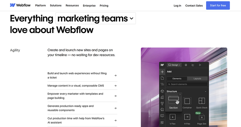
Here’s how Webflow does it
As you scroll, they immediately address the developer's objection by showing the actual interface (which looks like professional design software). They address the marketer's objection by showing visual drag-and-drop elements.
8. Write differently for different buyers on your page
In B2B SaaS, you're rarely selling to one person. The average buying group for complex B2B solutions involves 8.2 stakeholders. The Head of Sales wants to know about pipeline. The CFO wants ROI and payback period. The IT manager wants to know about security, compliance, and how easy it is to integrate. One page cannot speak perfectly to all of them at once, but it can be structured to try.
The starting point is identifying your primary economic buyer: the person with the budget authority, who will ultimately sign off. Write your hero section and your main value proposition for them. That's your primary audience, and if you try to speak to everyone in the headline, you'll end up speaking to nobody.
After that, use supporting sections, FAQs, and case studies to address the other stakeholders without cluttering your main narrative. If your product genuinely serves very different functions for different buyers, consider role-based sections or tabs ("For Sales," "For IT," "For Finance") that let each visitor self-select into the copy most relevant to them. It takes more work to build. It earns its place.
How Webflow does it
Did you notice something about the Webflow screenshot above? The same section speaks to multiple audiences but not all at once. If a designer visits the page, they can find out how the product suits them.

9. Treat your website copy like a product and keep iterating
Your website copy is a hypothesis. It is your best current guess about what your buyers care about, how they talk about their problems, and what will make them act. It should be tested, measured, and improved continuously, especially your headline, hero section, and primary CTA.
Pick two or three pages that attract the most traffic but deliver the lowest conversion rate. Start there. A/B test your headline. Try a shorter CTA button label. Remove a secondary CTA and watch whether the primary one picks up. Companies that actively use CRO tools report an average ROI of 223%, but only 39.6% of companies have a documented conversion rate optimisation strategy.
Closing this gap starts with treating your website like a product you ship and improve.
How Mutiny does it
Mutiny doesn't have one single homepage. They effectively have hundreds. If you visit their site from an enterprise SaaS company, their IP routing detects it, and you will see different headlines, different customer logos, and different case studies than if you visited from a 20-person startup.

A note on AI and your website copy
AI tools can help you draft, riff, and iterate faster. That's genuinely useful. But there's a catch that most B2B marketers are beginning to feel acutely: when every SaaS vendor uses the same AI tools with similar prompts, everyone's copy starts to converge.
Open ten B2B SaaS homepages right now and see how many times you spot ‘empower,’ ‘seamless,’ and ‘unlock’ before you lose the will to live. Why is this? Because generative AI scrapes so many terrible B2B SaaS websites!
Someone who has sat in on your sales calls and heard how buyers actually describe their problems. Someone who has read your churn surveys and knows what made customers leave. Someone who understands the specific language your best customers use, not the language that sounds professional in a boardroom.
Use AI to speed up the process but use a human to make it sound like you. Drop me a line for a free content audit (limited to a small number of companies per month).
Conclusion
Your website is a salesperson working every hour of the day, talking to prospects you'll never meet, building preferences before you ever get a call. The copy on it either earns that trust or erodes it, usually within the first few seconds.
These nine rules are a framework for thinking about your buyers first, your features second, and your business third. When that order is right, the copy follows. And when the copy follows, the demo requests do too.
Frequently asked questions
How often should I update my B2B SaaS website copy?
At minimum, review your homepage and primary product pages every six months. If you're running paid traffic to specific pages, review those monthly. Treat high-traffic, low-conversion pages as your highest priority. Copy shouldn’t be permanent.
What's the most important page to get right on a B2B SaaS website?
Your homepage and your primary product or solutions page. These are where the majority of your organic and paid traffic lands. If your headline doesn't immediately communicate what you do and who it's for, you're losing buyers before they've had the chance to see anything else.
Should my B2B SaaS copy speak to technical buyers or business buyers?
Both, but in different places. Your homepage hero should speak to your economic buyer, usually the person with the budget authority. Your product features page can go deeper for the technical evaluator. Use role-based sections, FAQs, or case studies to address secondary stakeholders without cluttering your main narrative.
How long should B2B SaaS website copy be?
As long as it needs to be to answer your buyer's questions, and no longer. High-consideration purchases like enterprise SaaS often benefit from longer, more detailed copy because buyers need to feel informed before they'll commit to a conversation. That said, length for its own sake is not a virtue. Every sentence should be earning its place.
Can I use AI to write my B2B SaaS website copy?
You can use AI to draft, brainstorm, and iterate copy faster. But raw AI output tends to produce generic, jargon-heavy copy that sounds like every other SaaS vendor, because it's trained on the same internet they're all drawing from. Always have a human rewrite, edit, and inject your specific buyer insight, proof points, and brand voice before anything goes live.
What's the biggest mistake B2B SaaS companies make with their website copy?
Writing about themselves instead of their buyers. Most SaaS websites lead with what the product does, not what the buyer gets. Flip that. Start every page with the buyer's problem or desired outcome. Your product is the solution to that problem, not the headline act.


